Before + After: The Heritage House reborn
Like golf, sometimes creating an entirely new look for a home is all about finesse.
Story by Barry Kaufman + Photos by Wayne Moore, Back River Photography
Any golf pro will tell you that you drive for show, but you putt for dough. The general idea behind that statement is that sometimes the perfect shot isn’t about putting your back into it and crushing it off the tee; sometimes it takes a delicate touch to create something amazing.
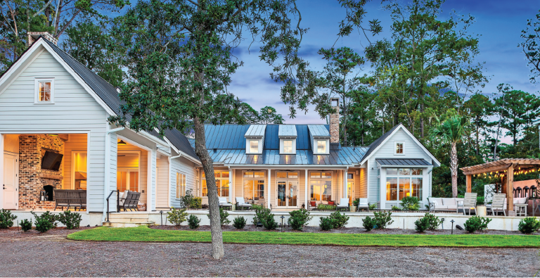
This house, owned by the Heritage Classic Foundation for use by visiting VIPs from the PGA and sponsors like RBC, is a perfect example of that. When Parker Paton of Parker Paton Design was tasked with dragging this classic piece of Sea Pines architecture into the 21st century, she knew it would require a skilled touch and subtlety.
“The foundation first remodeled the home in 2012 and created a great concept of the Heritage House being a mini-museum for their decades of history and memorabilia. But as the years went by and the home was used for an increasing number of overnight visitors, it was definitely in need of a substantial refresh,” she said. “With the tournament being an elevated event, it was time to elevate everything else.”
Brighter and lighter
One place where subtle changes made the most dramatic difference was in the home’s great room. With new artwork added to the wall each year, the effect had become something of a sports bar look, with frames meandering across the wall. The paint color selection, furniture and light fixtures created the new look, but it was the way Paton rearranged the art that had the greatest impact.
“The Champions portraits had previously been hung in chronological order, but they were all different sizes, so it looked cluttered,” she said. “We first had everything re-matted in soft white and then rehung based on aesthetics, with a long-term plan for the next several years of frames.”

After 
Before
A winning combination
Rearranging art in the den allowed Paton to find even more memorabilia from past tournaments to display, and finding more appropriate furnishings gave her space to let it shine.
“Even big sectionals can still feel like just a two- to three-person sofa, and they take up so much room,” she said. Window treatments brightened up the space, as did the addition of grass-cloth wallpaper, wall sconces and a custom rug.
“This is a really special room, and I wanted to be sure it still payed tribute to its original mission, which is to honor and showcase the Fraser family. It’s a great space for conversations — it’s a story-telling room.”

After 
Before
Playing with proportions
Finding smaller furniture helped create space in the den, but ironically it was finding larger furniture that helped the downstairs guest bedroom feel roomier.
“This room was under furnished, and an under-furnished room looks awkward,” said Paton. New materials also let Paton slip a sly wink to her friends at RBC. “Their CMO used to jokingly ask how they could convince the Heritage to turn the plaid blue, and I’d almost keel over at the table. The red Heritage plaid is iconic,” she said. “So when I found a beautiful fabric for the headboards that also happened to be blue plaid, I knew it would be a great subtle nod to RBC.”

After 
Before
Kitchen makeover magic
The kitchen provided an interesting challenge to Paton.
“In an ideal world when you’re doing a renovation like this, you tear up the kitchen, but we wanted to prioritize other areas, so we just made small changes in here,” she said.
As with the great room, a coat of paint and better use of space made a tremendous impact.
“You have to give yourself some white space, but when you have a collection, you want it to look curated and thoughtful,” she said. “One of the things for me that makes this project special is that we kept so much of the art, and we were able to reuse and better showcase some of the meaningful things in the home.”

After 
Before


