Home showcase: The rebirth of color
Think the modern look is all crisp whites and natural textures? Hue are in for a surprise.
Story by Barry Kaufman + Photography by Laurey Glenn
Across the spectrum of visible light, there are, of course, the classic seven ROYGBIV; but it’s the spaces in between those tones that create a nearly infinite array of colors. Given the unimaginable vastness of shades, tints and hues from which to work, why then are homes so often limited to white and taupe?
As this Sea Pines stunner proves, there is a whole world of color out there just waiting to beautify a space. But choosing the correct colors and presenting them in a way that reflects their vibrancy takes incredible skill. That’s where Hannah Fulton of J. Banks Design comes in.
“It was so fun to work with a client that embraced color,” said Fulton of working with homeowner Angie Prow. “I love color, so I think we were well paired here.”
Informed by a classical European use of palettes and textures, this home is a beautiful kaleidoscopic reminder of the power color has to enliven a home.


These walls talk
Exemplifying the European influence that Fulton brought to this project, the dining room carries the look of Victorian grandeur viewed through the lens of modernity.
“The wallpaper set the tone for the rest of the house. It’s printed on linen, so it has a gorgeous texture when you view it in person,” she said. “We sourced out antique mirrors and sconces to juxtapose with the modern chandelier, and it worked beautifully.”

Dynamic balance
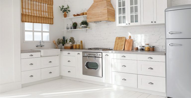
When working with bold colors, it’s important to balance out your tone of choice with contrasts, either in tone or in texture. Here in the kitchen we see the inspired way Fulton used both to contrast an eye-catching blue center island. Between the bold stainless and brass of the range hood and the fun patterns of the back splashes both in the kitchen and in the bar, this kitchen revels in artistic details.
“There are so many different materials in this space, which is fun,” said Fulton. “The metal cabinets flanking the range hood, the wood cabinets, the custom lights from Lowcountry Originals; it’s all interesting but doesn’t take away from the color.”

Living the dream
The grand living room pulls together an entire rainbow of colors, mixing them beautifully and creating visual interest in every corner. The window treatments in the breakfast nook, as well as the bold greens in the living room curtains, find a home in the rug as do the bold pinks of the artwork flanking the fireplace.
“We had the rug custom made to pull through all of the colors,” said Fulton. “The big focal points are the paintings of spoonbills; the scale is enormous on them. We worked with a custom artist, Heather Lancaster. We wanted to pop that paint but not make it overwhelming.”

Expert advice
Hannah Fulton’s rules for using color
Choose spaces wisely: The bunk room and the mudroom in this home, particularly, are unapologetically blue because they can be. Tucked away as they are, they can be audacious with color without competing against other spaces.
Give spaces personality: “I work hard to understand the function of a space,” Fulton says. Use everything, from how you’ll spend your time there to when you’ll spend your time there, to define the palette.
Play with intensity: Don’t be afraid to go bold in more off-the-beaten-path areas of the home, and tone it down in main spaces. “As much as I love using color, we did a classic, simple sofa in the living room. It’s important not to overwhelm a space.”