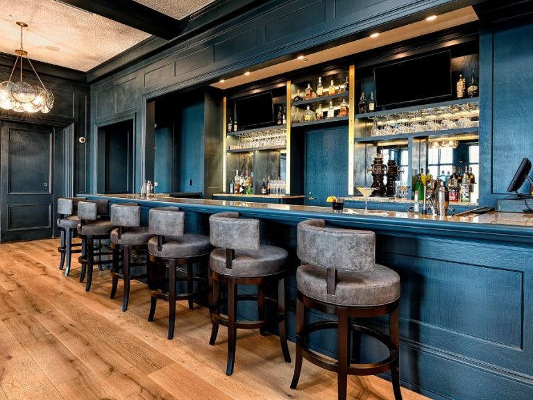
Bold Dining Room Ideas with Commodore Blue, Pure White & Tricorn Black
Colors of the month
Story By Lance Hanlin
Some colors whisper — Commodore walks in with purpose. This rich navy blue from Sherwin-Williams sets the tone for a dining room that’s bold, polished and full of personality. Paired with crisp Pure White on the ceiling and trim and grounded with Tricorn Black accents, the palette is confident without being cold. Natural wood, leafy greens and sculptural accessories soften the edges, making this space a perfect balance of elegance and ease. If you’re ready to make a bold move in your home, this palette proves how powerful a little color can be.
Get the look …
Start with Commodore on the walls (satin) and beadboard (semi-gloss) to set a strong foundation. The deep blue adds richness and structure without feeling overwhelming. Use Pure White on the ceiling (flat) and frames (semi-gloss) to lighten the space and highlight the architectural lines. Wide-plank light oak flooring keeps the room feeling open and natural. A patterned rug adds softness and a sense of movement. The mix of seating (bentwood black chairs paired with woven rattan armchairs) gives the dining area a relaxed and thoughtful look. A simple white table provides balance and lets the surrounding elements shine.
For contrast, bring in matte black accents. The dining chairs, side table and pendant lights from Rejuvenation add clean lines and help tie the space together. A sculptural lamp and a few stacked ceramics on the console introduce personality without clutter. Tall leafy plants bring in height and a fresh touch of green.
The artwork above the beadboard includes abstract line drawings and a nautical-style print that reflect the room’s color scheme. A neutral vase filled with dried stems makes for a subtle and easy centerpiece. This room shows how the right colors, natural textures and simple styling can come together to create a space that feels polished but still comfortable.
Walls and beadboard

Commodore (SW 6524)
This deep blue shines in rooms filled with daylight. It offers a striking backdrop without overwhelming the space. Applying it to both the upper wall and beadboard creates a seamless, intentional finish. Opt for a satin sheen on the wall for softness and a semi-gloss on the paneling to highlight texture.
Ceilings and frames

Pure White (SW 7005)
Clean and luminous, this balanced white keeps the room feeling open and fresh. It outlines moldings and ceilings with clarity, enhancing dimension without stealing the spotlight. Choose a flat finish above to diffuse light and a semi-gloss on frames for a subtle, refined contrast.
Accents

Tricorn Black (SW 6258)
This deep, saturated black sharpens the overall palette, providing crisp contrast against the softer hues. Use it on chairs, lighting, furniture or hardware to outline forms and ground the room with a clean, modern finish. It works especially well in small doses, giving just enough definition without overpowering the space.


