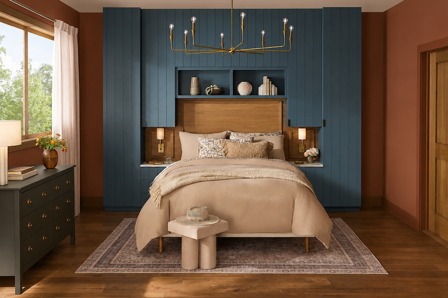
Create an Enchanting Bedroom With Bold Fall Colors
Burnished orange, moody blue and smoky brown-gray set a storybook scene, while natural wood, quiet neutrals and touches of brass keep the magic grounded.
Story by Lance Hanlin
Photo by Sherwin-Williams
Key Points
● To effortlessly blend bold colors, assign each one to a distinct role. Here warm orange envelops, deep blue creates the focal point and smoky brown-gray grounds the room.
● Balance saturated fall colors with cream bedding, pale curtains and understated upholstery to create quieter moments throughout the space.
● Natural wood bridges the warm and cool sides of the palette without making the bedroom feel overly coordinated.
● Brass lighting adds warmth and polish, while carefully repeated dark accents give the colorful room depth without introducing another competing shade.
Every memorable story needs a setting, and this bedroom certainly knows how to set the scene. Burnished orange walls wrap the space in warmth, a wall of deep, muted blue millwork creates an unexpected focal point, and a smoky brown-gray dresser adds one final note of mystery. On paper, three bold colors might sound like too much for a room designed for rest. Here they work because each has a role to play. Natural wood, creamy bedding and soft textiles quiet the stronger shades, while brass accents add just enough glow. The result feels warm, collected and slightly mysterious without sacrificing the calm a bedroom needs. For a month devoted to legends and lore, consider it proof that sometimes the most enchanting rooms begin with a little color courage.
Get the Look: How to Balance Bold Fall Colors
Borrow these ideas to bring the same relaxed coastal style into your own home.
Give Every Color a Role to Play
Choose colors that play different roles. Bold palettes work best when every shade has a purpose. Here orange envelops, blue commands attention, and the dark dresser grounds the composition.
Make the Bed Wall the Main Event
Turn the bed wall into the main event. Floor-to-ceiling mill work instantly gives a bedroom architectural presence. Extending it above and around the headboard makes the bed feel built into the room rather than simply placed against a wall.
Balance Warm and Cool Colors
Balance warm and cool. Pairing warm orange with cool blue gives the room energy while keeping the palette balanced. Neither dominates because each has enough visual weight to hold its own.
Give Bold Colors Room to Breathe
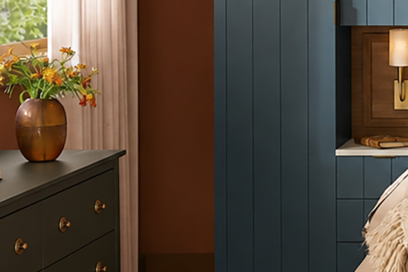
Give bold colors room to breathe. Cream bedding, pale curtains and understated upholstery provide necessary quiet moments between the stronger shades.
Bridge the Palette With Natural Wood
Use wood as a bridge. The headboard, nightstands, window trim, door and flooring introduce natural warmth that connects the orange and blue while keeping the palette from feeling overly coordinated.
Ground the Room With Dark Accents
Repeat dark notes sparingly. The dresser and small dark hardware details help anchor the room without introducing another competing color.
Finish With a Little Glow
Add a little glow. Brass lighting brings warmth to both the blue and orange while adding a polished note. The sculptural chandelier also draws the eye upward and emphasizes the height of the room.

Walls: Sherwin-Williams Pennywise (SW 6349)
With a name especially fitting for October, Pennywise gives the room its character. This warm terracotta brings to mind autumn leaves, sunbaked clay and burnished copper, making the bedroom feel cozy without relying on traditional neutrals. An eggshell finish keeps the walls soft while adding enough durability for everyday life.

Feature Wall: Sherwin-Williams Bunglehouse Blue (SW 0048)
This turns the wall behind the bed into the room’s defining feature. The deep, muted blue gives the floor-to-ceiling millwork visual weight and provides a dramatic counterpoint to the warm orange surrounding it. Extending one color across the cabinetry, paneling and open shelving helps the entire installation read as a single architectural statement. A satin finish highlights the vertical detailing.

Dresser: Sherwin-Williams
Nocturne (SW 9520)
Nocturne adds a dark, grounding note without competing with the room’s two dominant colors. Its smoky brown-gray tone gives the dresser more presence and creates another layer of depth in the palette. Against Pennywise, it feels especially rich, while warm hardware keeps the piece from appearing too heavy. A satin finish provides a smooth, furniture-like appearance with enough durability for a hardworking surface.