Paint leaders and color experts share the tones set to shape 2026
Earth tones lead the way on these shades of what’s next.
Story by Lance Hanlin
Color trends have a funny way of marking time. The avocado greens of the 1970s, the mauves of the 1980s, the Tuscan golds of the early 2000s and the gray-everything craze of the last decade all had their moment before stepping aside for whatever came next. Paint is still one of the easiest ways to make your home feel new again. A fresh color can modernize a kitchen, calm a bedroom or give purpose to a corner you’ve never quite figured out. Winter is one of the best times to tackle it in the Lowcountry, especially on those overcast, soggy days when it’s too messy outside for anything fun.
Of course, painting is still a commitment. Whether you’re climbing the ladder yourself or calling in a pro, you don’t want to choose a color that feels dated by spring. That’s where the annual Colors of the Year help. They offer a curated peek at where interior design is heading. This year’s picks from paint leaders and color experts point to a palette of grounded greens, warm browns, hushed neutrals and one surprisingly airy white. The mood is calm, connected and a little nostalgic, with plenty of depth for anyone craving more character at home.
Here’s a closer look at the shades the pros say we’ll be loving in 2026 and why they’re worth considering for your own spaces.
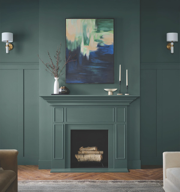

Behr Hidden Gem
Hidden Gem is that smoky jade that immediately slows your pulse. In this color-drenched living room, the walls, trim and mantle glow with layered depth, and the room feels like it was designed to unwind in. Rich woods, velvet textures and abstract art love this shade. It carries a sophistication that doesn’t try too hard, which makes it ideal for those who want a space with presence but not pretense. Try it for a library wall, a moody dining room or a den that doubles as a winter retreat on chilly evenings.


Pantone Cloud Dancer
Pantone named Cloud Dancer its 2026 Color of the Year, and it’s easily the softest, quietest pick of the bunch. This gentle white is meant to evoke clarity and calm, something many of us have been chasing in recent years. It isn’t stark or chilly. It feels more like early morning light reflecting off still water. It works especially well in bright, open rooms or in spaces where you want your art, textiles or views to carry the story. If you’re ready to try it at home, a quick Paint Score search will point you to a near-perfect paint match for this serene shade.


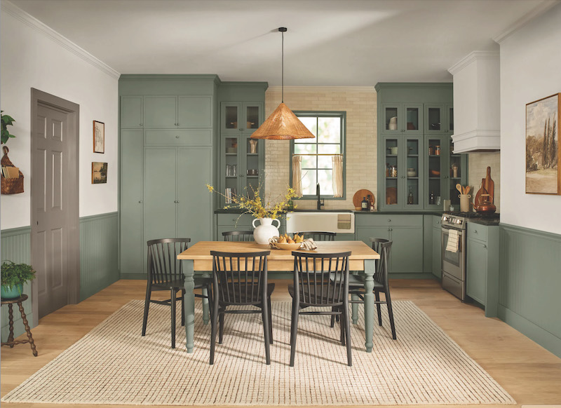
C2 Epernay
Epernay is a warm, earthy ochre inspired by limestone villages and sunlit stone. In this kitchen it washes the cabinetry in a soft, creamy glow that feels both traditional and fresh. This shade has a quiet elegance that pairs beautifully with brass hardware and natural light. It’s the kind of color that makes a room feel gently collected rather than decorated. Those with classic homes, or anyone craving a warmer neutral for their kitchen or mudroom, will appreciate how effortlessly Epernay adds depth without stealing the show.


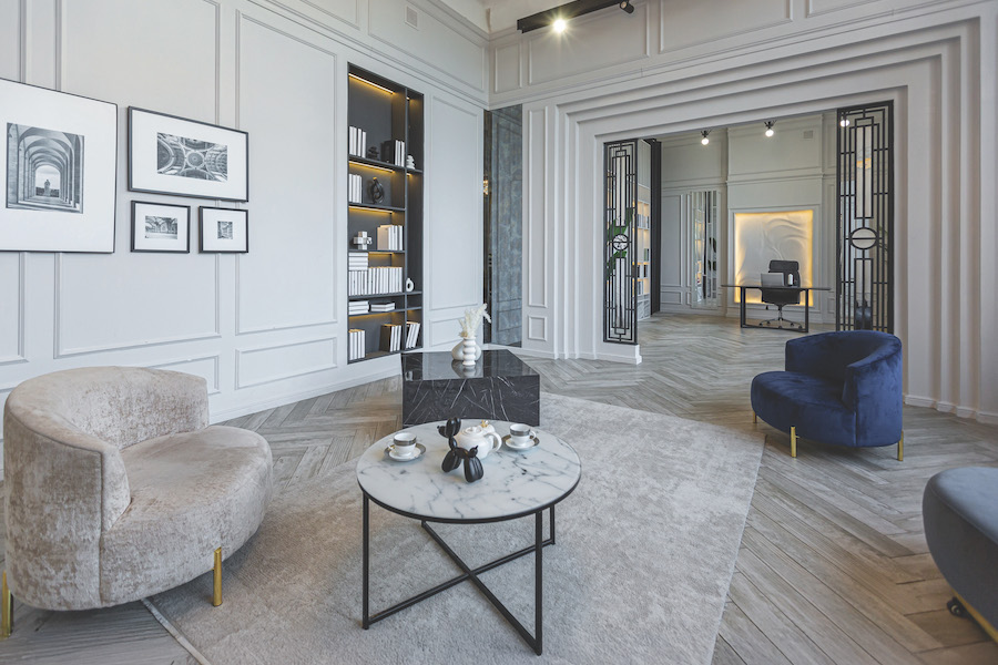
Benjamin Moore Silhouette
Silhouette blends burnt umber and charcoal into a color that feels as polished as a well-fitted blazer. In this paneled room the color wraps the walls in a warm shadow that’s surprisingly soft for such a dark tone. Paired with sculptural furniture or natural leather, it creates a modern take on classic coziness. Silhouette is perfect for anyone moving away from gray but not quite ready for pure brown. Use it in a study, a music room or anywhere you want a grounded, handsome backdrop that still feels approachable.


Dunn-Edwards Midnight Garden
Midnight Garden is a deep, muted green crafted for people who love a natural palette but want something more complex than sage. In this mudroom the color carries a subtle sophistication, especially when paired with bronze pulls and simple styling. It’s grounding without being too dark and instantly makes a room feel finished. This is a fantastic pick for built-ins, laundry rooms or entryways that need a hint of calm. It also plays well with the wood tones common in Lowcountry architecture.


Farrow & Ball Scallop
Scallop is one of Farrow & Ball’s rare new releases, and it’s already a crowd favorite. In this sitting room it creates a warm, rosy canvas that feels uplifting without drifting into sugary territory. It’s a pink for people who don’t think they like pink. The shade’s softness complements natural woven textures, blonde woods and casual styling. Try it in a bedroom, breakfast nook or hallway where you want a little color without overwhelming the space.


Dutch Boy Melodious Ivory
Melodious Ivory leans creamy with hints of peach and yellow. In this dining room it creates an inviting backdrop that highlights art, plants and handmade details. It’s an easygoing shade that welcomes layering, which makes it ideal for homes filled with collected pieces and heirlooms. If you’re looking for a color that feels warm but still airy, this could be the middle ground you’ve been seeking. It’s especially lovely for guest rooms or sitting rooms.


Sherwin-Williams Universal Khaki
Universal Khaki is exactly what its name promises: a neutral that works everywhere. In this dining room the wall color sits quietly behind furniture and terracotta, grounding the space without demanding attention. It’s warm enough to feel lived-in but light enough to keep things bright. If you’ve struggled to pick a foolproof neutral for an open floor plan, this could be the one.


Glidden Warm Mahogany
Warm Mahogany is a rich red with a grounded, earthy base. It shines in this bedroom, wrapping the room in a cozy, fireside glow. Paired with rust velvet, textured pottery and soft bedding, it becomes a space that encourages you to slow down. It’s bold but strangely calming. Consider Warm Mahogany for an accent wall, a dining room that comes alive at night or a space where you want a little romance without going full crimson.

Valspar Warm Eucalyptus
Warm Eucalyptus is a soft, retro-inspired green with comforting warm undertones. In this kitchen the color pairs beautifully with tile, wood and natural fibers. It offers a peaceful balance, especially for rooms where you want nature’s influence without going full forest green. It’s great for bedrooms, entryways or any spot where you want to create a refreshing pause in your home’s color flow.