Major paint companies reveal the rich, bold hues set to define 2025
Stirred, not shaken
Story by Alea Wilkins
From the cool calm of last year’s palette emerges a new wave of warmth and intensity for 2025. The major paint companies’ official colors of the year lean into richer, moodier tones — reds, browns and muted purples dominate with shades that feel both comforting and daring. Yet surprises like chartreuse and royal blue add playful vibrancy to the mix. This year’s colors encourage a step toward the bold and the beautiful. Perfect for those inspired by fresh starts, these colors balance modern elegance with a touch of intrigue. Whether you’re revamping a single space or planning a full-home refresh, the message is clear: embrace change with a splash of daring color.
Mauve moment

Cinnamon Slate by Benjamin Moore
Sauntering the line between cool and warm tones, Cinnamon Slate is a mixed shade that is anything but middling. At once exciting and comforting — refined and refreshing — the shade is perfect for any room in need of rejuvenation.
Dramatic depth

Rumors by Behr
Subtle cranberry notes peek through Rumors, a muted red. It recollects crisp air, but its cool tones charm even in warmer weather. Bold walls may intrigue on a first glance, but they whisper unexpected calm.
Deliciously dark

Raku by C2
A rich reddish-brown, Raku adds resplendence to interiors. Though intense on the offset, the hue melts into its surroundings to imbue homes with bold decadence. It pairs well with neutrals to emphasize its sumptuous shade.
Peachy keen

Caramelized by Dunn-Edwards
Wander westward with Caramelized, a dusty take on terracotta. Reminiscent of desert floors or wet sand, the paint invites observers to warmer, sun-drenched horizons. In daylight it surprises with a subtle peach note.
Uncharted potential

Mapped Blue by Dutch Boy
Discover the possibilities of Mapped Blue, a hue as versatile as it is timeless. Calling upon ocean exploration, the color can appear stormy next to dark blues and blacks, but styled next to burnt orange it resembles retro chic.
Enduring elegance

Elderton by Graham & Brown
The time-honored neutral is enlivened with cool undertones, yet it still conveys its classic sophistication. Add to offices or libraries for a cozy, contemplative atmosphere, or turn foyers into a worldly entryway. It’s a first-class shade that never fades.
Serene green

Quietude by HGTV Home by Sherwin-Williams
True to its name, Quietude brings peace to its surroundings. A muted seafoam, the shade whisks guests away to the tune of a babbling brook. Invoking creativity or bone-deep relaxation, this hue transports to a more tranquil state of mind.
Tasteful tint

Purple Basil by Glidden
An elegant eggplant shade, Purple Basil infuses rooms with lush sophistication. Its subdued saturation makes it a palatable take on the purple resurgence. Perfect pairings include crisp marble and gold accents, but save room for the pièce de résistance.
Hard-hitting hue

Hammered Black by Krylon
For a neutral with impact, Hammered Black hits the nail on the head. The spray paint shade looks like tar with an almost metallic sheen. Sharp and industrial, it redefines basic black without making it boring.
Purple pizzazz

Violet by Minwax
Whimsical and mystic, Minwax’s Violet wood stain enchants viewers with its magical look. Opt to blend pieces into an entirely purple decor à la the color-drenching trend, or transform wooden furniture to embellish rooms with bewitching flair.
Martini mural

Chartreuse by Sherwin-Williams
This year instead of one hue, Sherwin-Williams presents a nine-colored Capsule of the Year, celebrating 25 years of the annual tradition, and Chartreuse is the obvious standout. Lemon yellow and olive green combine to create a color full of zing, whether as an accent or across entire walls.
Knockout navy

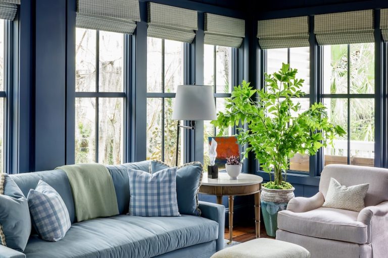
Encore by Valspar
Commanding attention, Encore is a blue almost oceanic in depth. The showstopper shade has a nautical air to it, inspiring viewers with visions of a salty shoreline or Ralph Lauren cologne. In essence, it’s a standing ovation to American luxury.


